Optimising a self service identity proofing portal
Case Study
posted on
1 Dec 2017
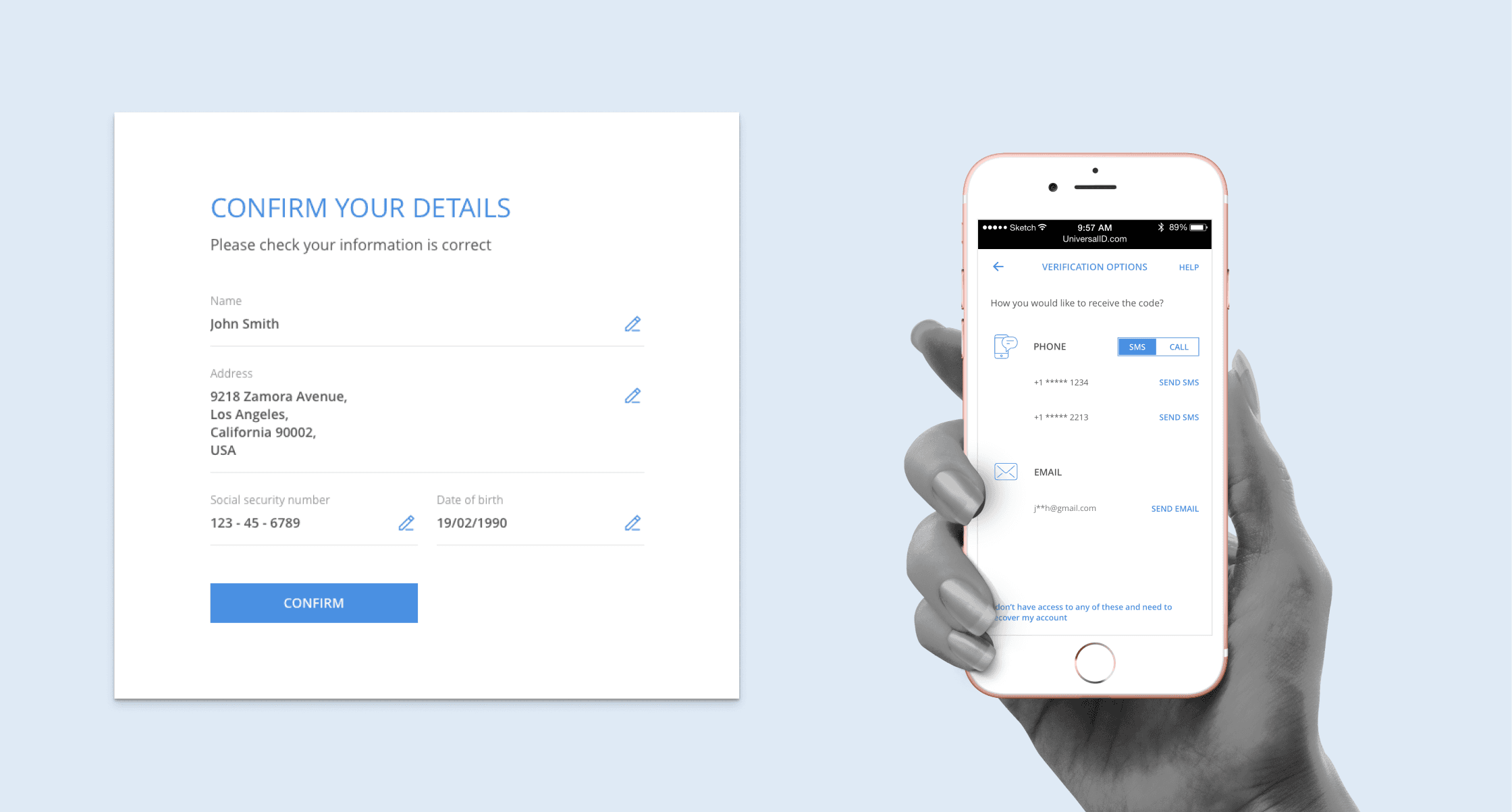
Universal ID was an identity proofing portal intended for government bodies, hospitals, and financial institutions. My role in the design was to improve the sign up conversion rate. The product itself was primarily made up of a long questionnaire with completion rate as low as 14% in some instances.
Interviews with SME’s and customers helped to define the goals for the redesign. Technically the product needed an overhaul as it suffered from both technical and experiential debt. Visually the product was subpar, but more concerning was the lack of context provided with the question set.
Goals
At the outset our number one goal was to improve the rate of success for registration. Additionally we wanted to reduce the friction by leveraging biometrics/push notifications, and decrease both support and engineering costs.
We were required to be device and platform independent, comply with Section 501 Accessibility guidelines, and meet NIST security standards.

Approach
The first thing I did was to run an audit on the existing product to evaluate what information was needed for verification. I made a big spreadsheet with every question that was currently being asked during the onboarding and verification process. For each question, I included a space to capture:
The business rationale
The user benefit
Whether it was required or optional
If the information was already known or available in other systems
How they would use this information
Any other conditional criteria
It was important to move clients away from wish lists and back to thinking about the objective set to get their people verified so they could access services needed to do their jobs.

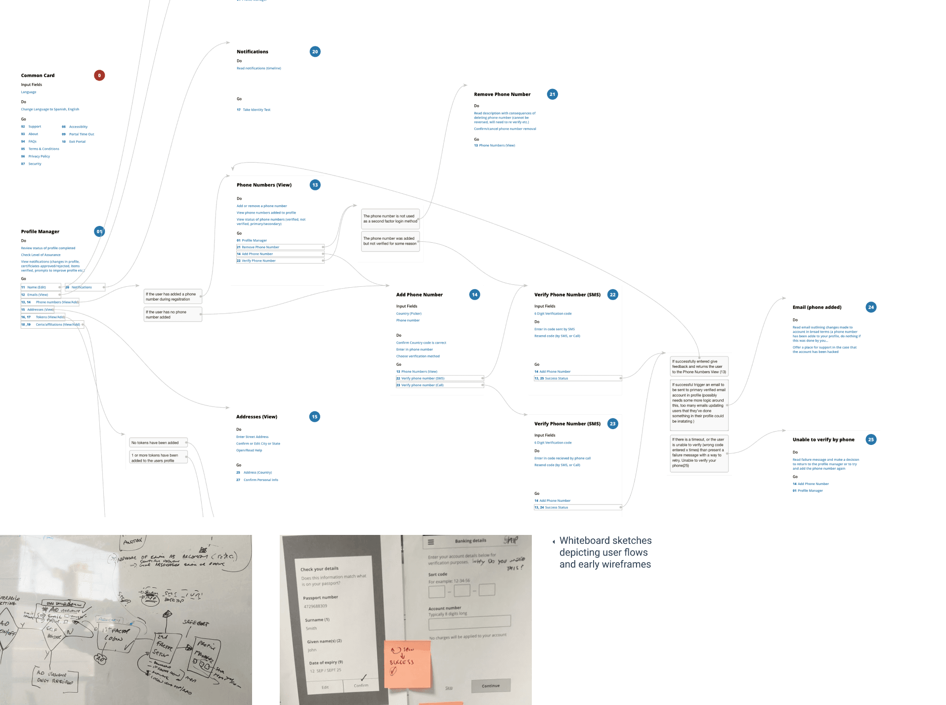
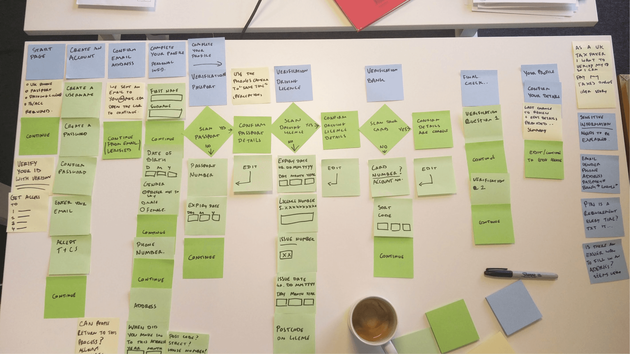
IA artefacts including DoGo Map and sketches of flows which were posted around the office in Dublin
Guiding principles
Working as part of a trio of product, engineering, and design I worked up some guiding principles for Universal ID to follow
Design with configuration in mind so the product can be tailored to customers needs
Test out assumptions early and acknowledge bias through usability testing
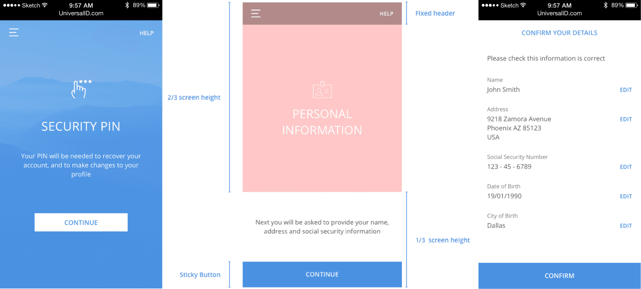
Set smart defaults to reduce the effort to complete and align with user goals
Automatically pre-fill values in input fields
Ensure inputs are flexible – E.g. Accept multiple possible phone number formats
Use appropriate keyboards on mobile
Provide easy access to contextual help and further information where sensitive information is requested to reassure users
Practice inclusive design by making sure that the end product was accessible/usable to as many people as reasonably possible

Outcome
Unfortunately this project ended up getting shelved and repackaged at a later date as part of a separate white label offering. Our "trusted" partners at the outset were Equifax who suddenly became very untrustworthy in 2017 due to being culpable for the greatest data breach in history.
209,000 credit card numbers were taken. After nudging a couple of executives towards retirement and offering credit monitoring to affected citizens, Equifax is still, at the time of writing, a $16 billion company, valued just 4% lower than pre-leak levels. The consequences of identity theft fall more on consumers than the companies responsible.
2020, Cennydd Bowles - Future Ethics
My team was decimated, with the majority getting let go as part of a restructuring. I subsequently left Synchronoss to join Workday in January 2018. I am proud of the work I did at Synchronoss. Design campaigned and fought to build something inclusive, fought to eliminate optional questions during the registration flows, and took novel approaches informed by research to reduce the friction with authentication.
For example, doctors aren’t great when it comes to passwords. For this reason so we set about using the microphones on their phones to match ambient noise, and using bluetooth to detect when they were near their systems.


